
Short card title
Supporting copy in the marketing grid pattern.
Internal
Tokens live in global.css
(@theme). Reusable UI lives in
src/components/guides/. This page is
noindex and disallowed in
robots.txt.
Use gw-* and semantic aliases (
primary,
secondary,
accent) from the theme. Meta and secondary
copy: text-gw-on-surface-variant.
gw-background
gw-on-surface
primary
secondary
accent (= gw-accent, #e879f9)
gw-primary-container (lavender fills)
gw-surface-lowest
gw-surface-container-low
gw-surface-container-high
gw-surface-container-highest
gw-ink (marketing band)
font-sans — Plus Jakarta Sans (body, UI)
font-display — Baloo 2 (headlines, emphasis)
Scale (see @theme in
global.css): text-xs 13px, text-sm 14px, text-base 16px,
text-lg 18px — with tuned line-heights. Interactive controls (buttons, tab buttons, CTA links): minimum
text-base (16px); never 14px on those surfaces.
.editorial-shadow on panels
.gw-brand-gradient-text — logotype (#7c3aed → #e879f9)
Drop cap on the first paragraph of a scenario opener using the drop-cap class.
Defined in global.css. Prefer these classes over ad-hoc
bg-[radial-gradient(…)] on production pages. See
docs/DESIGN_SYSTEM.md for pairing (typography, CTAs).
.gw-surface-panel-soft
Default light panel for profiles, celebrity masthead, app bridge card — purple-50 → white → blush border.
Card shell: .gw-ds-try-app-panel in
global.css (
src/components/ds/TryGiftyWowPanel.astro).
.gw-hero-gradient-band
Light Content Hub hero (pale purple → blush, full-bleed bands).
.gw-occasions-hero-spotlight
Ink base (#1a0b2e), top-center spotlight
(#4c1d95 → ink), soft purple bloom. Used on
/occasions (OccasionsHero.astro).
Guide narrative and long-form pages use gw-reading-body
(16px with relaxed leading on small screens, 18px from md up, in
global.css) with
text-gw-on-surface. Optional
md:text-lg on marketing sections when you need an explicit 18px
band without that class.
Chrome and meta: at least text-xs (~13px from theme); do not use
smaller arbitrary sizes for required reading.
The home masthead on index.astro is a deliberate
display-size exception; guide heroes use up to md:text-4xl.
Control minimum: any
<button>, tab control
(role="tab"), or CTA-styled link (filled or outline pill) must use at least
text-base (16px). Do not use
text-sm (14px) for those labels.
gw-btn-primary: gradient fill,
text-base font-bold.
gw-btn-secondary: outline pill (same padding rhythm), lower emphasis — both in
src/styles/global.css.
Use this on Celebrity Gift Edit layouts when the gift count can vary between 5 and 12. The pattern keeps one clear featured tile, avoids repetitive equal-card grids, and preserves semantic list structure for accessibility and crawlability.
gw-swatch--*)
CSS-first chips live in
src/styles/swatches.css. Slugs match
swatch-queries.json material labels (e.g. “delicate lace” →
gw-swatch--delicate-lace). Sequin shimmer respects
prefers-reduced-motion.
gw-swatch--sequins
gw-swatch--rhinestones
gw-swatch--delicate-lace
gw-swatch--fringe
gw-swatch--velvet
gw-swatch--satin
gw-swatch--fur
gw-swatch--linen
gw-swatch--canvas
gw-swatch--denim
gw-swatch--leather
gw-swatch--brass
gw-swatch--marble
Imported from src/components/guides/. Hub-wide
primitives that are not guide-scenario-specific live in
src/components/ds/ (tokens for those live in
global.css). Category map:
categoryPillClasses.ts.
48×48 artboard, rx="14" tile, white gift
glyph at translate(12,12). Light variant
fills the tile with the brand gradient tokens; dark uses a translucent white tile. Same geometry as the hub
bridge gift badge.
Wordmark plus BrandGiftBadgeIcon.
This is sample intro copy. Real guides pull strings from JSON.
Alex Kim for Jordan Lee
Friend to friend · Melbourne
A short italic deck that sets the emotional frame before the story.
Sample product name · $49 AUD · Example Retailer
View at Example Retailer
Guide narratives: gradient display text + soft vertical rule. Not the same as editorial cited quotes on
/about.
Pull quotes use gradient text and a vertical accent bar.
Long-form attributed quotes (problem section, founder bios). Styled via
.editorial-cited-quote in
global.css
(default bottom spacing: --spacing-gw-editorial-cited-quote-after).
Pass flush to remove outer margins.
"Short sample quote body in italic, with a left primary bar and muted attribution below." — Demo Name, Role
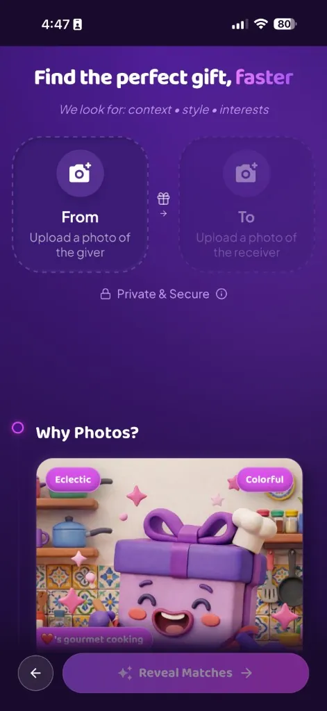
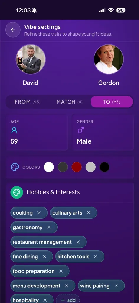
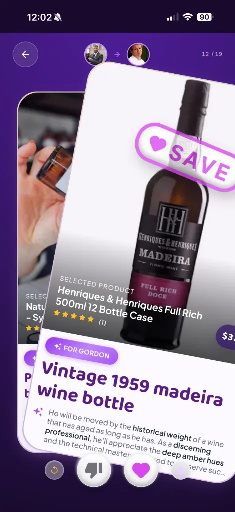
Personalized matches based on context, not just categories.
Sample outro copy. Wire to guide JSON outro fields on real pages.
Try GiftyWow
Light “get your edit” / app bridge card (celebrity page masthead, occasions). Use
src/components/ds/TryGiftyWowPanel.astro only.
Below lg: centered card + secondary button; at
lg and up: horizontal layout with QR (same
href). Shell and copy tokens:
.gw-ds-try-app-panel,
.gw-ds-try-app-panel__title,
.gw-ds-try-app-panel__copy, and
.gw-ds-try-app-panel--desktop* in
global.css; mobile CTA uses
gw-btn-secondary plus
.gw-ds-try-app-panel__cta.
Snap a photo. Let me read their vibe. You get a curated gift edit in under two minutes.
Start Matching
Used on /about. Same tokens as the rest of the hub;
reference implementation: src/pages/about.astro.
of all gifts end up unused, returned, or thrown away
"Same component as founder bios: surface panel, 4px primary left border, 16px italic body, 13px semibold cite." — Octavia, Co-Founder
Sample step copy. Real pages use multiple steps with dividers between them.
Supporting copy in the marketing grid pattern.
Use group on
details and
group-open:rotate-180 on the chevron. Match
visible answers to any FAQPage JSON-LD.
Use these on guides/[slug] (or future templates)—not
to optimize this internal page.
h1 per guide (hero headline).article with stable
id for deep links.
h3 under that article.alt for images.Optional blocks for clear, extractable answers. Use factual, specific copy—avoid thin duplicate FAQs.
In 2026, Mother’s Day in Australia is Sunday 10 May (second Sunday in May).
Sample answer: scenarios reflect fictionalised family contexts; each product is illustrative for the narrative.
Reusable primitives for occasion landing hubs (for example anniversary, Mother's Day, or graduation). Keep pages data-driven and compose from these blocks instead of duplicating layout markup.
Hands-on cocktail session with skyline views.
See in GiftyWowUse this between product sections to bring users into matching.
Takes about 2 minutes.
Compact end-of-page variant.
Stable layout blocks, typed content data, and consistent CTA patterns.
Only when the page includes visible FAQ content that matches the JSON-LD.
Weekly ideas, occasion guides, and practical recommendations.
We respect your inbox. Unsubscribe anytime.
Add structured data in the guide layout when URLs and schema are finalised. Use
FAQPage only if the page includes visible FAQ content
that matches the markup.
{
  "@context": "https://schema.org",
  "@type": "Article",
  "headline": "Mother's Day 2026: Gifts She'll Actually Love (AU)",
  "description": "Stuck for Mother's Day gift ideas? …",
  "datePublished": "2026-02-13",
  "author": { "@type": "Organization", "name": "GiftyWow" }
}